Hocco Ice Cream
Packaging Design, Space Design, Social Media & Campaign
We’re here on a super chilled-out mission to end urgency with ice cream.
One of India’s renowned ice cream makers was looking to re-enter India’s mass market ice cream segment with a whole new brand - Hocco. Mass-market ice creams in India continue to be dominated by established, albeit aging brands that have been around for decades.
At Thought Over Design, I had the opportunity to help create a brand with a fresh POV and voice that could stand out in the category, and be loved by our dairy-obsessed country.
Wordmark
An emblem for the Hoccoverse, embodying superhero-esque characteristics. It’s a playful rescuer from your daily stressors that marries a youthful sensibility with clear and impactful typography.
Dynamic Brand Symbol
Inspired by a superhero mark, the symbol is used as a secondary identifier for the brand. The H itself is illustrated to represent changing forms, morphing into different flavours, objects and textures.
Regular Range Packaging
The regular range has a variety of products including novelty ice creams. The packaging for this follows a duo-tone system designed to stand out in packed freezers.
Creamery Packaging
The exclusive packaging for Hocco creameries showcases a glimpse of the Hoccoverse and features the brand symbols.
Retail Menu
The retail menu, designed for general trade stores and retail outlets showcases Hocco's expansive product portfolio. It is conceptualised to look like a map of the Hoccoverse.
Boss Bar Packaging
The bar of all chocolate ice cream bars, an indulgence that’s made with 100% Belgian chocolate. In a comic book or a game, it would be the bar you would eat after you’ve conquered the others – it is the Boss Bar. The classic gold type captures the chunkiness of the bar.
Space Design for the flagship Hocco Creamery
We collaborated with interior designers and art directors to create an experiential and interactive space through glass facade decals, murals and integrated designs within the architecture of the space itself, that help bring the Hoccoverse and the mascots to life, at the brand’s first flagship ice cream store in Ahmedabad.
We also helped the team select finishes, textures, colours and tiles to ensure an honest and playful expression of the brand.
Social Media Templates
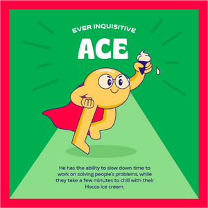
We designed a series of social media templates that introduce the dreamy brand world of Hocco.
Credits
Lead Designer
Anisha Sirur
Core Design team
Aayushi Kay
Tanvisha Chugh
Tabitha D'souza
Extended Design team
Ganesh More
Hridaya Shah
Shreya Chajjed
Creative Director
Anushka Sani
Strategy Lead
Disha Pinge
Strategy Team
Rohini Pandey
Divya Bhagat
Copy
Vera Desai
Aishwarya Prabhala
Project Management
Nishita Mohta
Mesha Bhansali
Urvi Dedhia
TheVibe Website
Conceptualisation, Planning, UI / UX, Copy writing
While I was working with TheVibe as Creative Head, renewing their website design and online presence was one of my main projects. TheVibe is a video-first content studio that functions as a creative production house but also has a community led, storytelling presence that they call the 'Editorial.' The brief was to create a strong and visible distinction between the two brand personas on their website, while giving each their own space for content and visibility.


